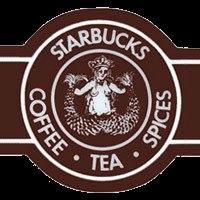
The Original Starbucks Logo
The history of the Starbucks logo follows a changing siren through the company’s transformation from a Seattle shop into an international brand. Starbucks began in Seattle in 1971 as a seller of coffee beans, tea, and spices. Its identity drew on the sea: the name recalled the first mate in Moby-Dick, while designer Terry Heckler developed a brown circular mark around a twin-tailed siren. The original illustration was much more detailed than the face familiar on cups today, and the surrounding words described the products the young business sold.12
The siren’s appearance also shows why a logo must work at different scales. Starbucks’s own history explains that the original figure’s uncovered torso became more conspicuous on large delivery vehicles than in small printed uses. Heckler adjusted the hair to cover her. That is a practical design story, rather than evidence of a mysterious hidden message.1
1987: green and a different business
Howard Schultz’s Il Giornale acquired Starbucks in 1987. The revised identity combined elements of the businesses, replacing the original brown with green and simplifying the figure. The company name was shortened in the surrounding ring. This was not merely a colour preference: the business was moving from the identity of a coffee merchant towards the experience of the coffeehouse.12
Green then became a repeated visual cue across storefronts, packaging, and cups. The persistence of the siren mattered as much as the change in palette. Keeping a recognisable central figure allowed the new business to present continuity while changing how people encountered it.
1992: the face comes forward
The 1992 revision tightened the view of the siren. Her face and crown became more prominent, while much of the lower body and tails moved out of the crop. The result was easier to read at a glance. A logo that once invited inspection of an engraved-looking scene increasingly behaved like a compact, repeatable symbol.1
These changes should not be described as a wholesale replacement of one character by another. The twin-tailed figure remained the foundation. What changed was the amount of information visible, the relative weight of the portrait and lettering, and the way the image performed on a small surface.
2011: the name disappears
For Starbucks’s fortieth anniversary, the 2011 identity removed the outer name ring and allowed the green siren to stand alone. The company linked the decision to a business whose ambitions extended beyond coffee. By that point, repeated exposure had taught customers to associate the figure with Starbucks without needing the wordmark.13
The sequence is a useful lesson in brand recognition: simplification depends on familiarity. A nameless symbol can be effective after decades of exposure, but the same choice would have meant something very different for an unknown shop in 1971. The modern identity is the accumulated result of earlier designs, not an image that arrived fully formed.

The story at a glance
Starbucks Logo Timeline
Follow the evidence
Sources & further reading
Numbered links in the text point to these sources. Dates and interpretations are identified as approximate or disputed where the evidence requires it.