
Apple’s First Logo and Its Historical Setting
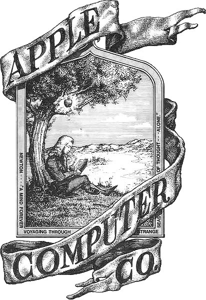
The history of the Apple logo includes two very different images: an elaborate scene of Newton and a remarkably economical piece of fruit. Apple’s original 1976 emblem, designed by co-founder Ronald Wayne, depicted Isaac Newton beneath an apple tree. It was a densely illustrated composition, with lettering and a literary quotation surrounding the scene. This was a visual argument about discovery and intellectual imagination rather than the compact symbol now familiar on devices.12
The scene’s detail also created a practical limitation. A complex illustration loses clarity when reproduced at a small size. Apple was entering the personal-computer business, where its identity needed to work on products, advertisements, and packaging. The change that followed was therefore a shift in visual structure, not simply a different colour scheme.
Rob Janoff’s 1977 design
In 1977 graphic designer Rob Janoff created the bitten apple associated with the Apple II era. The outline replaced a narrative scene with an immediately recognisable shape. The missing bite helped distinguish the fruit, while the multicoloured stripes suited a computer being marketed with colour capabilities.23
The familiar silhouette is the essential innovation. A viewer does not need to read a quotation, recognise Newton, or inspect a landscape to identify it. Although later interpretations attached many symbolic explanations to the image, a designer’s own account and surviving examples should take priority over stories invented after the logo became famous.
The rainbow and its afterlife
The striped version became closely associated with Apple’s early personal computers. Its bands were not simply a natural rainbow reproduced in conventional order; they were a designed arrangement within a distinctive outline. The relationship between colour and shape made the mark vivid while keeping the basic silhouette stable.13
A common myth connects the bite to Alan Turing’s death. It is an evocative retrospective interpretation, but it is not supported as the documented reason Janoff created the design. Another tempting story turns bite into a deliberate computing pun on byte. A pleasing pun should not be promoted into established design intent without reliable evidence.3
One shape, many finishes
From the late 1990s onward, monochrome versions became increasingly prominent as Apple’s products and visual language changed. Black, white, metallic, translucent, and illuminated applications gave the mark different material appearances. It is more accurate to understand many of these as treatments of the established shape than as entirely new logos.12
The history makes a distinction between a logo and its rendering. The silhouette supplied continuity; colour and finish connected it to particular products and eras. That flexibility helps explain its longevity. Apple could change the surrounding industrial design and advertising while retaining a mark that customers already recognised.
The story at a glance
Apple Logo Timeline
Follow the evidence
Sources & further reading
Numbered links in the text point to these sources. Dates and interpretations are identified as approximate or disputed where the evidence requires it.