Pepsi’s Early Logo and Script Lettering
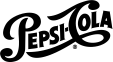
The logo history of Pepsi reveals how an ornate wordmark developed into a compact identity built around a globe. Pepsi-Cola emerged at the end of the nineteenth century, and its early identity relied on decorative script. That style belonged to a wider world of soft-drink lettering, where a distinctive name on signs and packaging helped a product stand out.12
A logo chronology should distinguish the drink’s naming history from the launch of each graphic form. It should also avoid assuming that a new design instantly removed all older bottles and signs from circulation. Commercial objects often preserve overlapping versions.
The bottle cap becomes a symbol
During the twentieth century, a red, white, and blue bottle-cap design became central to Pepsi’s identity. The cap supplied a recognisable enclosure for the lettering and connected the graphic directly to the physical packaging in which customers encountered the drink.12
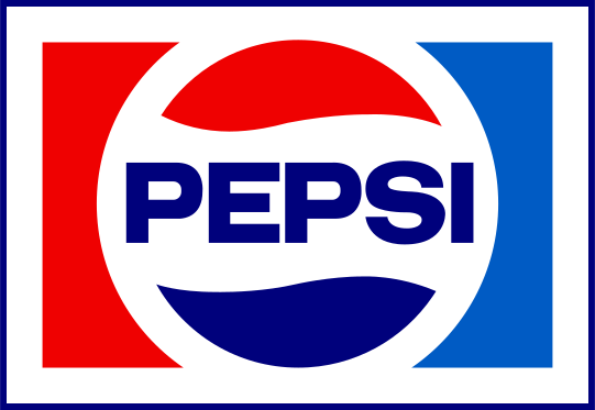
As the identity developed, the name shortened visually from Pepsi-Cola to Pepsi in prominent uses. Simpler lettering and a more abstract circular design gradually reduced dependence on the original script. The mark became easier to apply to different packages, signs, and advertising formats.
The globe develops
Later versions treated the red and blue areas, separated by a white band, as a standalone globe-like symbol. Changes in typography, spacing, and the shape of that white division produced different identities without abandoning the basic colour relationship.1
The 2008 redesign made the white band asymmetrical and paired the symbol with lower-case lettering. Public explanations and unofficial interpretations attached many meanings to the shape, but the observable historical change is clear: the wordmark and globe became more distinct elements within the system.12
The 2023 return to the centre
Pepsi announced a new identity on 28 March 2023, describing it as the first update to the globe in fourteen years. The new design placed the Pepsi name prominently within the circle and added a stronger black component to the visual system. It drew on earlier recognition while preparing the identity for contemporary digital and physical uses.3
The announcement specified a North American rollout in 2023 and wider global introduction in 2024. Those stages matter when dating a photograph or package. The redesign is a useful example of returning to an older structural idea without reproducing an old logo unchanged: the name, circle, colours, and surrounding motion language form a newly coordinated system.
The story at a glance
Pepsi Logo Timeline
- 1898
The Pepsi-Cola name enters the brand’s history.1
- Mid-20th century
The red, white, and blue bottle-cap identity becomes prominent.12
- Later 20th century
The circular globe and simplified Pepsi wordmark develop.1
- 2008
An asymmetrical globe accompanies lower-case lettering.2
- 2023–2024
A new identity restores the name within the globe through a staged rollout.3
Follow the evidence
Sources & further reading
Numbered links in the text point to these sources. Dates and interpretations are identified as approximate or disputed where the evidence requires it.